Design Systems
“the most trusted voice in music, tailored to you”
About the Project
This UI UX case study was inspired by Joy Zagars’ redesign improving the navigation and user experience of the Pitchfork Media website . The challenge is to renew the focus on editorial curation and make it easier for users to find what they’re looking for within the site, rather than relying on external search engines. Additionally, the project aims to create new opportunities for advertising while prioritizing partnerships and addressing accessibility issues such as long periods of text and not enough contrast. The end goal is to provide a more enjoyable and efficient experience for users.

Project Specs
Team : Independent
Role: Research, Initial design,
Interviews, Wireframe, Wireflow, Lo-fi/Hi-fi prototype.
Tools: Figma, Use Berry, research.
Length: 3 months
How Might we
How might we leverage the failures of the last Pitchfork application and the current PWA, while incorporating the successes of Joy Zagars’ website redesign, to design the best possible version of a Pitchfork application that not only pays tribute to the original website users but also incorporates user-centred design?
Empathize
I started by doing a little market analysis to understand if a native app was viable and desirable.
Flurry Analytics, studied the use of mobile devices for reading publications, and found that it has been steadily increasing over the years. In 2016, mobile devices accounted for 55% of all time spent on digital media, and by 2021, this figure is projected to reach 75%.
According to a survey conducted by the Association of Magazine Media (MPA) in 2020, 59% of magazine readers use their smartphones to access magazine content, compared to 28% who use a desktop/laptop and 13% who use a tablet
Regarding the importance of native apps for publications, a study conducted by Pew Research Center found that users tend to prefer native apps over mobile websites when consuming news content. In fact, the study found that 85% of smartphone users who consume news prefer using a news app, while only 14% prefer using a mobile website.
Market analysis references
- Flurry Analytics (2017). “State of Mobile 2017” report. https://www.flurry.com/blog/state-of-mobile-2017/
- Association of Magazine Media (2020). Magazine Media 360° Brand Audience Report.
- Pew Research Center (2016). “News Use Across Social Media Platforms 2016” report. https://www.journalism.org/2016/05/26/news-use-across-social-media-platforms-2016/
What does this mean?
Given the increasing trend of mobile usage for reading publications and the preference of users for native apps over mobile websites, Conde Nast’s Pitchfork Media would benefit from a well-thought-out native app that provides a seamless user experience and features specifically designed for mobile devices-rather than just relying on a PWA. This would enable Pitchfork to engage its readership more effectively and capitalize on the growing mobile market for media consumption.
Define
Previous friction points and SUCCESSES
- Content curation is a reoccurring problem for any magazine or content heavy website.
- Previous iterations have not been designed with accessibility standards in consideration.
- Each iteration is honouring the nostalgia of the brand.
- The last web redesign (2016) was very successful for the site engagement and traffic.
Design Challenges
The following list of four design challenges are an amalgamation of the challenges that face the Pitchfork media website, my own observations of failures of the current PWA, struggles of other popular magazine transitions to native app, and user interviews and research.
1. Editorial Curation
There is so much content in this industry which is wonderful, but I want to design a page layout for a mobile Pitchfork media application that reduces cognitive overload and has learnable gestures and patterns that users will quickly become familiar with and grow to love.
2. Navigation
How might we redesign current PWA bottom navigation bar, and design a simple navigation feature within the app. During the original redesign, it was found that most users utilize a search engine to navigate between Pitchfork pages, instead of navigating through the site, indicative of an overcomplicated search feature.
Ideate & Deliver
challenge 1/2: Editorial curation
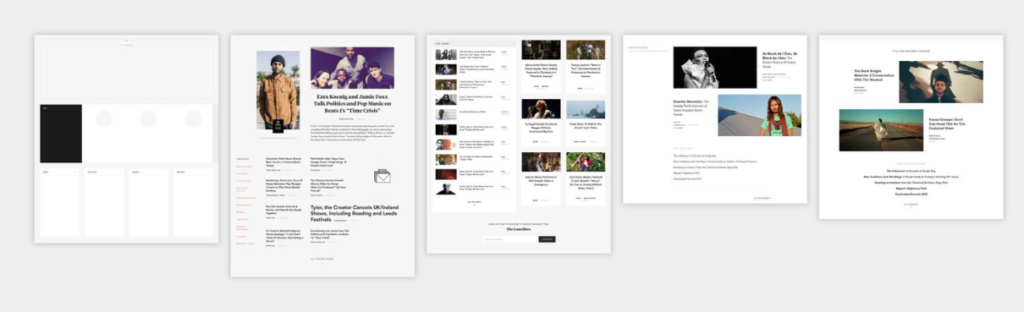
This is the current sites content organization pattern. in the teams redesign this was closely followed. However, the web content pattern does not translate well into a mobile experience, as validated in user interviews.
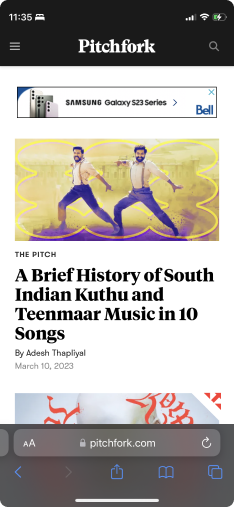
These are screenshots from the current PWA.
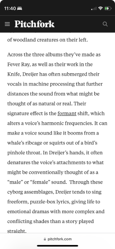
The content is why users love Pitchfork! Every user i spoke with verified that the look to pitchfork for reviews and ratings on new music.
However, the format the current PWA translates editorial content results in cognitive overload. With no accessible options for text to speech or adjusting font size.
Solution 1/2: EDITORIAL CURATION
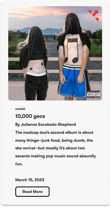
- Organized from most popular content users are looking for to least popular.
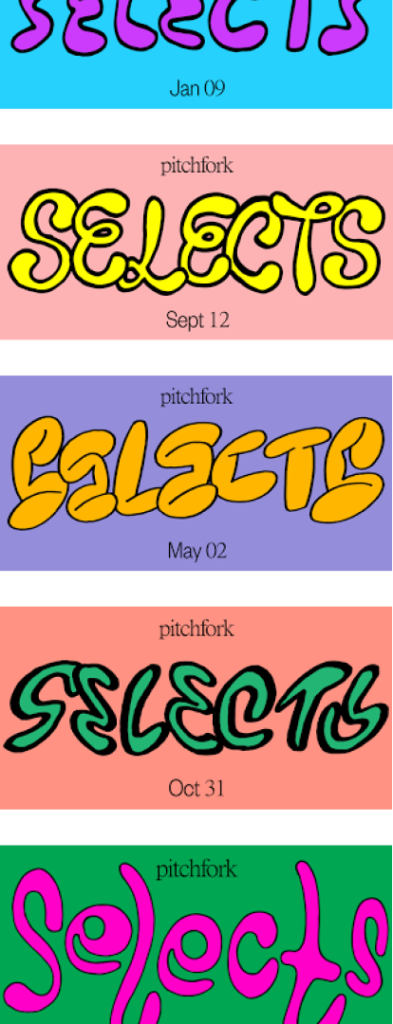
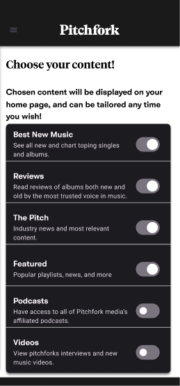
- On the account page the user can choose content to be displayed on the slider navigation bar.
- When designing, the original 2016 content template was followed.
- Articles have “Read More”CTA breaks in content, for a more accessible reading experience.
CHALLENGE 2/2: Navigation
Joy’s observations in 2018 (below) have been addressed via the website in 2018, however the mobile navigation methods still present a problem today. Users found it “confusing” and “barley visible.” If you use pitchfork on your phone, do you search what you’re looking for via google? I know I do.
“Users are googling our content rather than using our own search tools. We all love our Google, but why are people leaving our site to find something published on it?How might we make it easier for users to find what they’re looking for within Pitchfork, instead of relying on an external search engine?”
http://joyzagar.com/case-studies/pitchfork-website-redesign
- This current bottom bar does not pass WACGAA standards and has a confusing choice of iconography according to users.
- The music feature only appears when on the PWA, however this feature was not known to 90% of my user interview participants.
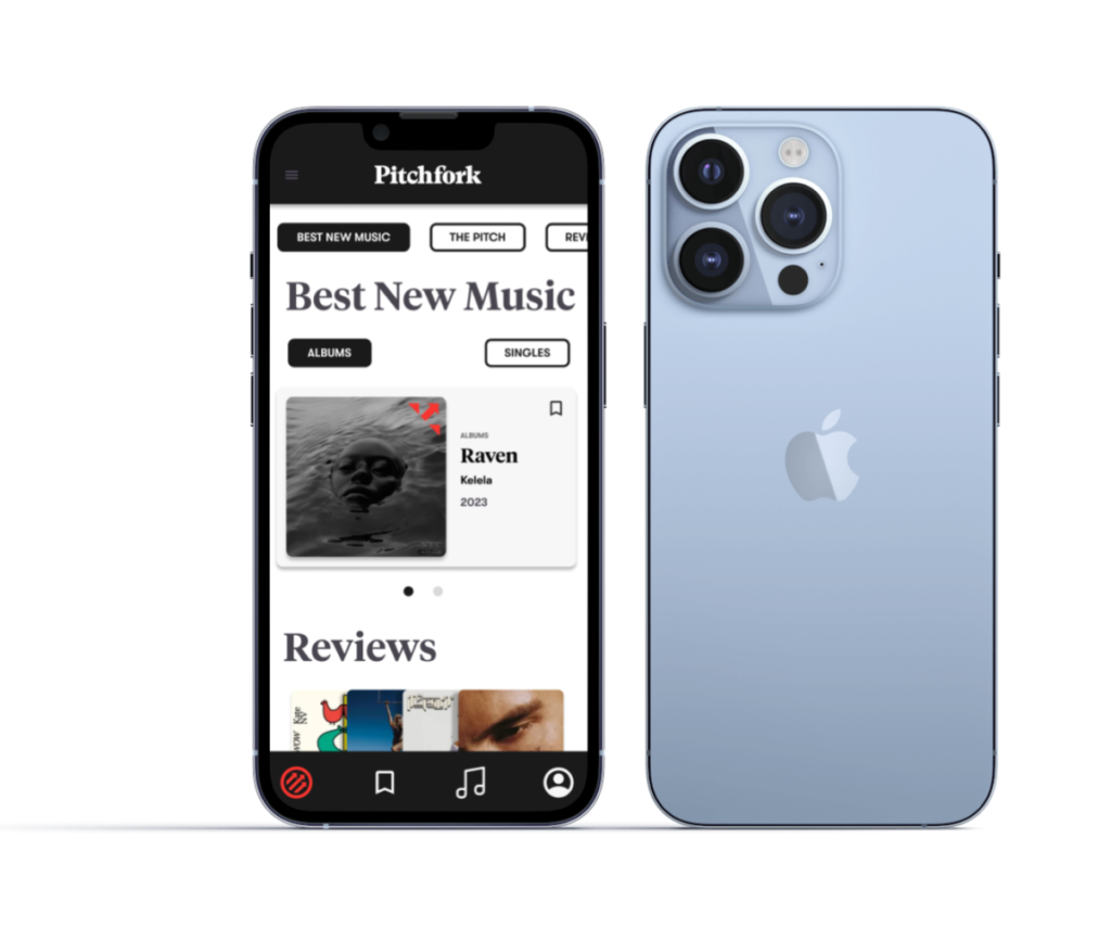
SOLUTION 2/2: Navigation
Below is the navigation smooth scroll slider we decided would be most beneficial for the Pitchfork mobile experience. Attached you will also find the icons, bottom bar, and menu page–all designed for ease of in app navigation.

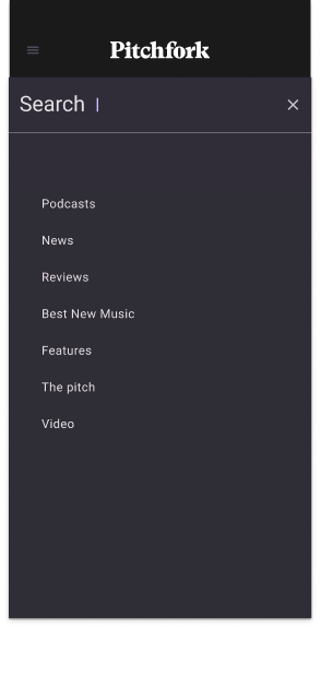
- “>Drag navigation bar curated by the user.
- Hamburger menu displays search, and main content. categories
- The app was built with atomic design, and a shell structure. Each tab uses single page smooth scroll navigation.
- We also redesigned the icons, now learnable, and passes WCAG standards,
- Music feature is front and centre, for users to discover!

Next steps
conclusions & lessons
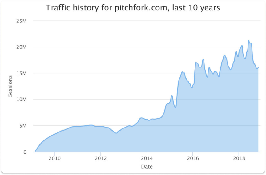
As online publications are increasingly accessed by mobile devices it only seems logical to move toward a mobile experience that compliments all those users who love Pitchfork. The graph below demonstrates the linear increase of user traffic since the 2016 redesign. This is only a more convincing argument for the viability, feasibility, and desirability of a Pitchfork media application.
Below is the onboarding progression, which displays the three main focus’ of the mobile experience.
“the most trusted voice in music, tailored to you”
“Since launching this redesign in March 2016, traffic to pitchfork.com has tripled, and continues to steadily grow.”
Joy Zagar
STILL LEARNING…
- The wireframe and lofi – prototype were overly ambitious and missed the scope of my initial purpose statement.
- Due to the change in direction testing led data that informed the final product, but put pressure on the final stages of the product.
- This is a passion project however, and we are still working and testing out our theories. This hi fi prototype attached is a visualization of the general structure of the project but is still under construction!